profile / alumni / graphic-design
October 17, 2018
Writer: Mike Winder
Photographed by Juan Posada
Graphic Design alum Whitney Lowe shifts from designing campaigns for Fortune 500 companies to sculpting by hand
A few minutes away from Portland, Oregon culinary mainstay The Woodsman Tavern stands the midcentury residence of Graphic Design alumnus Whitney Lowe (BFA 82). On this gray summer day, the artist and graphic designer is providing a tour of his packed yet organized music room, which includes 16 feet of vinyl records and a top-loading Micromega CD player. “Oh my God, it’s amazing,” says Lowe with a grin, when asked if the French-made hi-fi player reveals sounds usually left unheard. “It pulls out everything. Things you don’t even want pulled out.”
If there’s one thing you need to know about the Sacramento–born Whitney Lowe, it’s this: Wherever the rest of the herd is grazing, he wants to be somewhere else. A former creative director at Wieden+Kennedy and a founding principal of Los Angeles–based design firm ReVerb, Lowe spent 25 years in the graphic design and fast-paced advertising arenas before switching gears to focus on creating ceramic and sculptural art by hand. It’s a decision Lowe, represented by Froelick Gallery in Portland’s Pearl District, came to after the events of September 11, 2001 when he began to reevaluate how he wanted to spend his days on this planet. “It was an incredibly tragic time,” says Lowe. “And I found a way to connect to those events with work like this.”
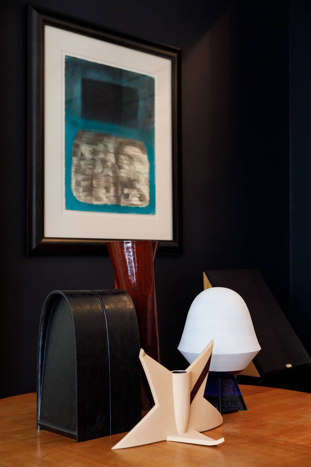
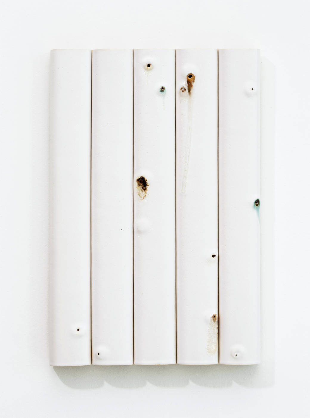
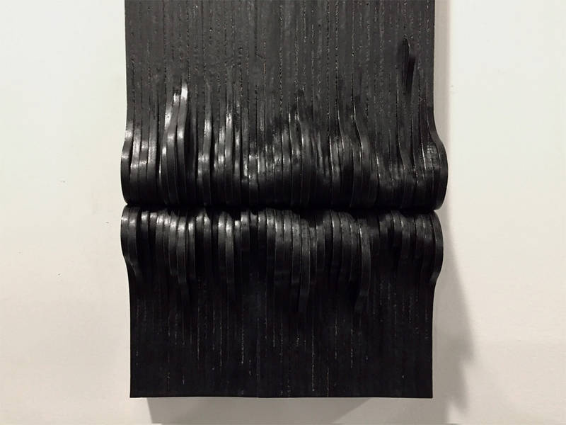
“This” refers to his 2014 glazed ceramic series “Eruption,” four works (from a series of 12) of which hang on a wall in his dining room. Sentinel-like, they stand watch over a variety of graphic design pieces Lowe has picked out from his archives and spread across his dining table. These include the hand-drawn masthead for Art in America he designed for fellow alumnus Takaaki Matsumoto’s (BFA 80 Graphic Design) mid-’80s redesign of the magazine, and several ads for Microsoft’s Windows 98, part of a campaign he says was seen by “millions, if not billions” that he created at Wieden+Kennedy for the Redmond, Washington-based software giant.
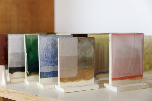
Each piece from “Eruption” features five truncated vertical channels that have been punctured, the holes oozing fluxing substances of varying colors and viscosities. Lowe created this effect by backing each hole with a small vessel and filling it with materials that explode outward when they’re heated during the kiln firing. Since the works are placed vertically in the kiln, the substance drips down the facade. “There was a lot of testing of the materials,” says Lowe.
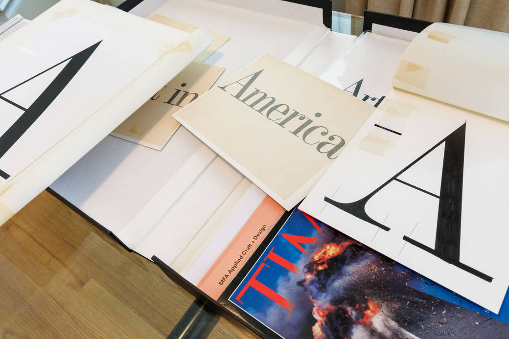
Also sitting on the dining table is Lowe’s copy of Time magazine that came out on September 13, 2001: the black-bordered issue with Lyle Owerko’s photo of the World Trade Center the moment the second plane hit the south tower. The “Eruption” series nods to the austere architectural exterior of the twin towers. And those exploded holes? They’re the desperate individuals who leaped to their deaths from the burning buildings. “I was thinking about the monumentality and the scale-less-ness of that architecture,” says Lowe of Minoru Yamasaki’s stark buildings. “And then the people just jumping out of those windows.”
He places on the table a blueprint for a piece from “Eruption,” which includes markings that indicate the location of the exploded holes. He then covers the blueprint with a semitransparent sheet containing a typographical treatment of an opening paragraph from Cormac McCarthy’s 2006 novel The Road. Aligning the two reveals a secret: Each hole from the piece corresponds exactly to the placement of a period from the text, an “interruption” that broke the flow of the text. “The things that go through my head at night,” says Whitney with a laugh. “Who knows?”
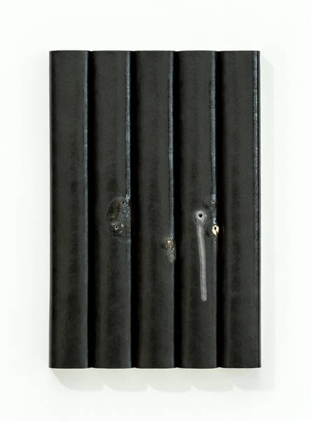
What we do know is that this work deals with more than the tragic events of September 11. It draws from several other sources, including Lowe’s obsession with typography (“Type is just a very natural thing to me,” he says) and his appreciation for the writing of McCarthy (“The sparseness of his language in The Road is so important to this work”). Composed of seven white and five black glazed works, “Eruptions” also playfully evokes the keys of a piano, a tip of the hat to the 20th-century musical manuscript. “I particularly love the punctured scrolls composed by Conlon Nancarrow for player piano, and the otherworldly graphic notations of composer Cornelius Cardew,” says Lowe. “They did incredibly beautiful work that speaks to me in profound ways.”
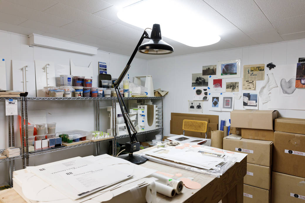
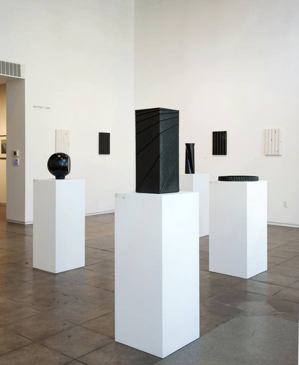
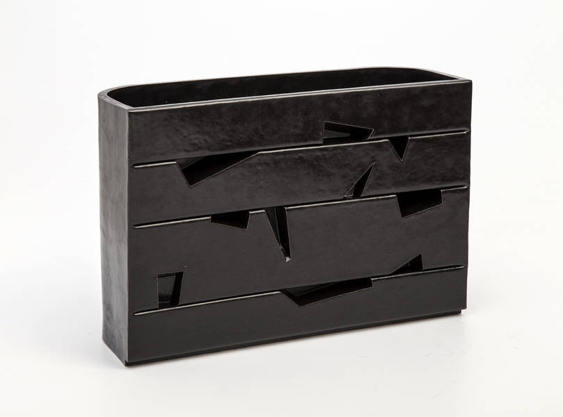
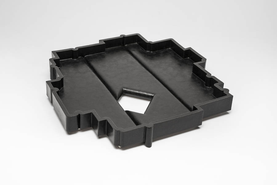
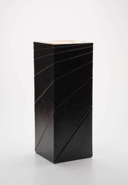
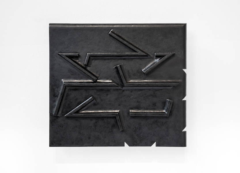
And Lowe’s work seems to be speaking to others as well. His solo exhibition Whitney Lowe: By Design ran this past spring at Oregon College of Art and Craft’s Centrum Gallery. The exhibition focused as much on his current work exploring mass and void via black surfaces as it did on the intricate tools he hand-made to create the work. “When I post work online, I write, ‘This was made by hand! It was not 3D-printed,’” he says with a laugh in his downstairs studio, a converted space that Lowe thinks was used as a game room by the previous owner.
“I really love making work that strives to elevate the lowly clay material,” he adds. “If I can envision it, I can make most anything down here.”