profile / faculty / graphic-design
December 20, 2017
By Prof. Gloria Kondrup, Executive Director,
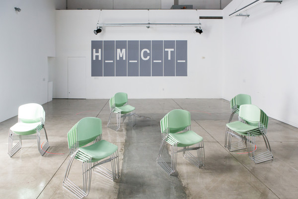
Hoffmitz Milken Center for Typography
All images courtesy of Gloria Kondrup
The Hoffmitz Milken Center for Typography: Two Years, Two Paths, One Destiny
I was supposed to be a lawyer.
A product of perhaps the best quality of public education, I excelled in school and finished my last semester of high school working as the executive intern for the mayor of New York City. I enjoyed public service and thought I should pursue a degree in law.
Then in my History of Art 101 class, I heard the word “juxtaposed,” and everything changed. It was a beautiful word, both in definition—“to compare and contrast things or people next to each other”— and how the letterforms themselves reflected this definition.
My legal aspirations were replaced with the study of fine art and art history. I was fortunate to study with some of the best in both fields, including William H. Gerdts and Phillip Pearlstein. I started an advanced degree program in curatorial studies at New York University, but I still had to eat, pay rent and pay for school. Working for the renowned non-profit gallery Artist Space was not going to cover my expenses.
A close friend who was already working as a graphic designer convinced a small design firm that I was talented and trainable, and I was introduced to an X-acto knife, ruling pen and typography. I became obsessed with learning the discipline and business of graphic design and developed a successful consultancy with clients that included Henry Dreyfus Associates, AT&T and Avon.
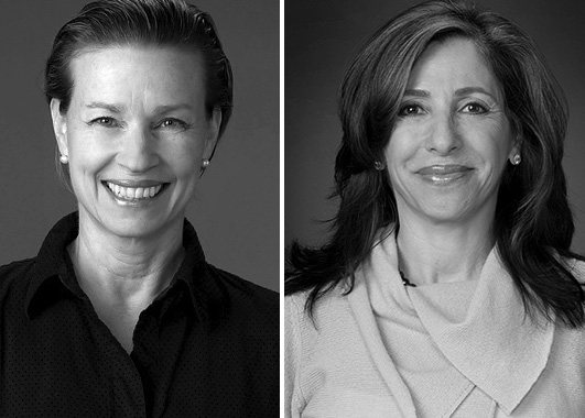
Gloria Kondrup (left) and Leah Hoffmitz Milken
I moved to California in 1991 and began graduate studies at ArtCenter. I saw this as an opportunity to validate my knowledge and expertise, and to further my interest in the growing area of sustainability.
At this time, the language and pedagogy of design education and the design profession in general, was not inclusive of environmental concerns. I was determined to change this.
I started my graduate studies and quickly felt the financial pressures of being a student again. I had to sell a valuable sapphire ring in order to complete my final graduate project. (Word of advice: don’t interview for a graduate program in a pink Chanel suit and expect financial aid.)
I was supposed to reenter the professional design arena full-time.
But as a graduate student I discovered a love of metal foundry type, letterpress printing, and that I was actually a good teacher. In 1993, I began teaching at ArtCenter, first packaging design under the mentorship of long-time faculty member and former trustee Hal Frazier (BFA 1955 Advertising). My love of typography and language also grew and I now had my own printing presses. What was supposed to be a temporary stop on my professional and personal journey, became my journey.
Unlike the patchwork quilt of education and experiences that built my typographic expertise, Leah Hoffmitz Milken was a typographic thoroughbred. Type was in her blood and her genes (her father was a typesetter). Leah received a master’s degree from the world-renowned Switzerland’s Schule für Gestaltung Basel (Basel School of Design) where she studied the work of influential typographic personalities such as Armin Hofmann, Emil Ruder and Wolfgang Weingart. Her work has shaped the visual language of many major corporations—FedEx, Xerox and Nokia to name a few—and her talent, knowledge and experience have shaped the typographic and graphic design program at ArtCenter College of Design. She was a real typophile and scholar. Leah knew more about incunabula, cuneiforms, and the development of classical typefaces than perhaps anyone in Los Angeles.
I met Leah during the second term that I was teaching at ArtCenter, in the fall of 1993. Our studio courses ran from 9 a.m. to 4 p.m. with an hour break at noon. Faculty from all majors ate lunch and socialized. It was random whom you ate with, but like all school cafeteria environments, groups gravitated to each other. One day I cackled my not-so-dainty laugh, and it drew Leah over to my table. From that day in the cafeteria, Leah became my best friend and beloved colleague.
I became the director of Archetype Press in 2004 (in addition to teaching branding and identity systems) and Leah developed the Digital Font Design program (while still teaching rudimentary letterform design using plaaka, a dense black ink that is extremely difficult to master). This is a highly specialized area of expertise that sits on the opposite technology spectrum of setting type by hand and letterpress printing (my area of expertise), yet shares the same typographic vocabulary. Contemporary font design develops and literally shapes the anatomy of typefaces and language, but in the digital landscape.
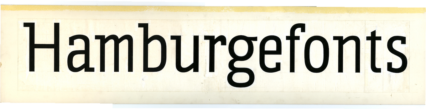
Work by Leah Hoffmitz Milken
Leah and I loved our students. Most of them were as dedicated to learning as we were dedicated to teaching. To paraphrase Carl Jung: “One looks back with appreciation to the brilliant teachers, but with gratitude to those who touched our human feelings. The curriculum is so much necessary raw material, but warmth is the vital element for the growing plant and for the soul of the student.”
Leah and I would spend hours trying to fix, undo, or give clarity to what students were attempting to create. Back and forth they would go between us, with their logotypes and logo marks. I would recommend one thing, Leah another. We spent hours on the phone debating which typeface to use, Cheltenham or Clarendon. Although we differed about the merits of Helvetica and Caslon, we both agreed on the shortcomings of offensive typefaces that seemed to permeate the landscape of design. And with mutual respect for each other’s expertise, I think the students were somewhat entertained by the dialogue and saw the benefits of collaboration and dedication.
Leah and I taught side by side for over 22 years, a period of time that saw four College presidents, five Graphic Design department chairs, 66 semesters, and over 4,000 students. We shared the unusual life rhythms of the ArtCenter year: 14 weeks of teaching, three weeks off, 14 weeks of teaching, three weeks off, 14 weeks of teaching, four weeks off. Although we shared a quirky and sublime friendship of two very different women, our love of typography, our students, our fellow educators, and teaching trumped all. She picked me up at LAX one Christmas morning after I had an accident in the jungles of Guatemala. I had cracked a root in my tooth and had developed a raging infection. There I was in my jungle sub-commando Marxist attire, and there was Leah in 5” heels, pushing a luggage cart. “Darling you look marvelous and so thin!” (I had lost 15 pounds because of my ordeal.)
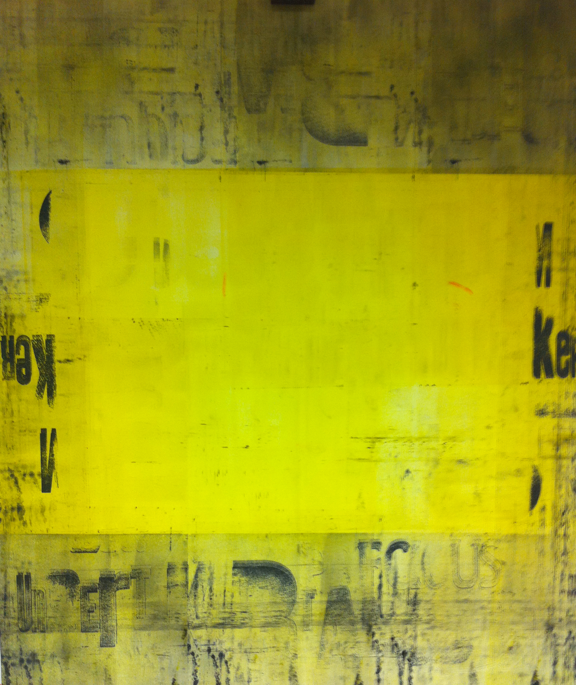
Work by Gloria Kondrup
Work by Gloria Kondrup
Leah Hoffmitz Milken was supposed to be my best friend and colleague, forever.
When the realization hit that this was not to be, a deep abyss began to develop in my teaching at ArtCenter. It was not the same, could it ever be the same?
Leah Hoffmitz Milken passed away from a malignant brain tumor, but not before she knew that her passion and dedication to the advancement and study of typography was to be continued with the creation of the Hoffmitz Milken Center for Typography (HMCT). Since its opening in November 2015 through the generosity of the Lowell Milken Family Foundation, the HMCT has furthered Leah’s legacy with generous student scholarships and awards, educator grants, visiting lecturers, exhibitions and workshops. Its growing partnerships with other educational and professional organizations, both nationally and globally, are unique and aligned to ArtCenter’s core mission for their students to learn, create, and influence the future through design.
I have come to realize that I am supposed to be the Executive Director of the HMCT. Perhaps I will return to full-time teaching in the future but for now I’m dedicated to ensuring that the love both Leah and I shared for typography and language is preserved, and that our long-time bond as friends and educators also endures through her legacy.
The mission of the Hoffmitz Milken Center for Typography is to set the global standard of excellence in typography and design education; provide a valuable service to the educational and professional communities as well as the public, reinforcing the meaning and value of typography; elevate and advance the teaching and understanding of both letterform design and typographic practice; and honor the past and anticipate the future of typography in print, digital and emerging media in a society of rapidly changing visual communication methods.