feature / alumni / faculty / advertising / graphic-design / illustration / photography-and-imaging
February 10, 2017
Writer: Scott Timberg
Seeing Noise: How Art and Design Transformed Popular Music
You can’t see it; you can’t smell it. It doesn't weigh an ounce. Music is just a sound wave, an arrangement of vibrations that merely, invisibly, shakes the air.
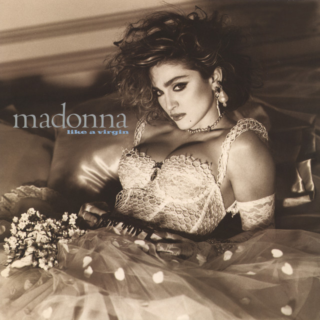
So why then, when we think of music, do we think of Chuck Berry’s Gibson 335, Mick Jagger’s lips, the cover of Revolver, Michael Jackson’s zombies, Blue Note’s stark photography, and Madonna’s breasts?
Why are people who don't know the difference between Bud Powell and Thelonious Monk able to recognize that an album jacket with minimalist iconography and a musician brooding in the shadows probably enfolds a jazz record? Or that an LP with a young aristocrat standing on a snowy mountain peak likely contains German or Austrian symphonic music? Or that an album jacket with bold sexual imagery (Kanye West, say, or Mötley Crüe) will contain a different kind of tension than what you’ll hear on an album with ’60s film stills or monochromatic photography (The Smiths, Belle & Sebastian).
And while some musicians avoid visual representation altogether—refusing to let themselves be photographed or appearing publicly only in masks or disguises—others are impossible to fully understand apart from the design side of their work. How do we grasp David Bowie or Prince without their visual representations?


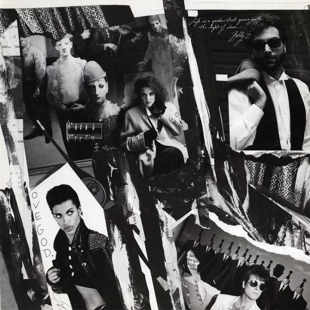


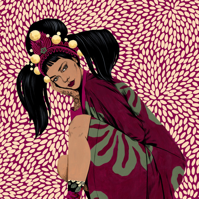
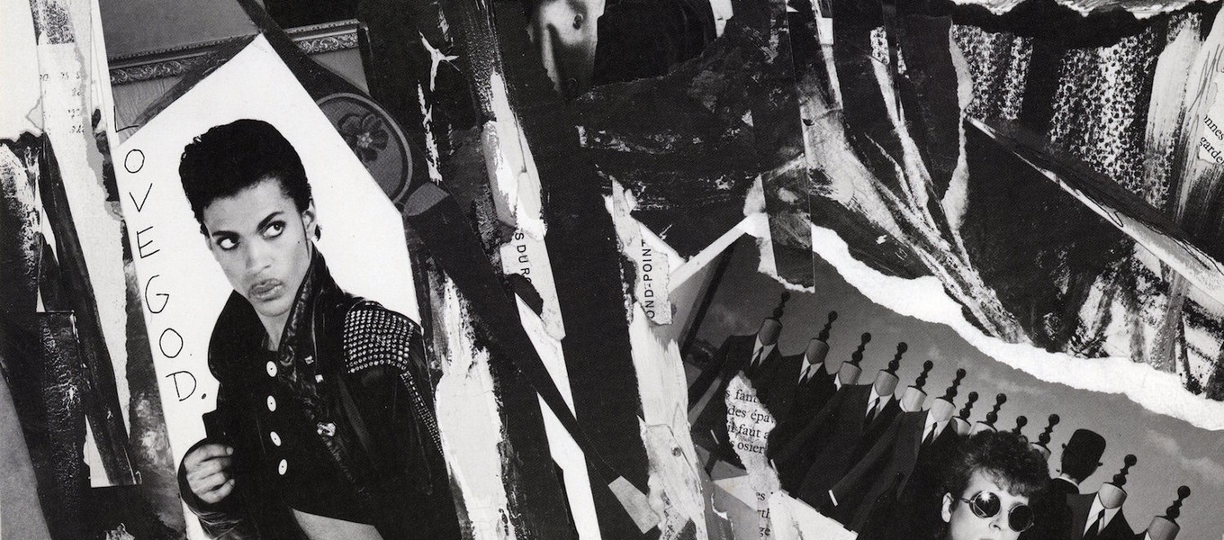
“All musicians consider themselves artists,” says Ann Field, chair of the Illustration Department at ArtCenter, who has designed work for bands since the 1980s. (She did the photo collage for Prince’s Parade LP.) “A lot of them paint. They’re very inclined to have an opinion on the visual; they’re very attuned to it.”
The importance of design has risen and fallen over time, but has always been central, says Simon Reynolds, a UK-reared, Los Angeles dwelling music writer whose recent book Shock and Awe looks at glam rock artists like David Bowie, T. Rex and Roxy Music. “Pop music,” he says, “has always been a 50/50 between visual and audio.”
ArtCenter's Photography and Imaging Department Chair Dennis Keeley left his New Jersey home to move to California in the 1960s partly because of the scenes he saw on Beach Boys LPs and the West Coast jazz albums shot by William Claxton. “All these pictures were showing the kinds of relationships I wasn’t having,” he says. “These guys were like my family.” He later became a percussionist and photographer who shot Tina Turner, The Replacements, Elvis Costello, and R.E.M.
You cannot see music—but you can see the people who love it. “I know from growing up what it’s like to walk down the street with an album under your arm,” says Field, who was raised in Brighton, UK. “ ‘I’m cool and I’m part of this realm.’ ”
It just didn't occur to people that you could correspond the music to some kind of visual image. Someone had to think of that.
Robert Fink, Chair, Music Industry Minor, Herb Alpert School of Music, UCLA
It just didn't occur to people that you could correspond the music to some kind of visual image. Someone had to think of that.
Robert Fink, Chair, Music Industry Minor, Herb Alpert School of Music, UCLA
Visual imagery has been part of the way we hear music for as long as there’s been music; we can see it in things like the reports of Franz Liszt’s flowing, extravagant hair and of Chopin’s translucent complexion.
But sometime in the 1930s—as aesthetic Modernism flourished in architecture, book jacket design, painting and sculpture—the design side of the music business became more explicit and sophisticated. “It just didn’t occur to people that you could correspond the music to some kind of visual image,” says Robert Fink, who chairs the Music Industry minor at the Herb Alpert School of Music at UCLA. “Someone had to think of that. Sometime in the ’30s they realized that this was a lost opportunity. It had to do with Modernism.”
By the rock era, of course, the ability to use imagery to signal modernity or youth or hipness—in ways that echoed off of film, visual art, and fashion—accelerated significantly. From Elvis Presley’s decision to grow sideburns (Marlon Brando became famous sporting them in The Wild One, but Presley had worn sideburns for years because he wanted to look like a truck driver), Little Richard’s pompadour, Buddy Holly’s horn-rimmed glasses, the Beatles’ matching Carnaby Street suits, the Who’s Pop Art sweaters, and Andy Warhol’s visual curation of the Velvet Underground, rock music’s first two decades were marked with visual flair even before the boom of art-school-trained musicians began in earnest. Not to mention that the tools of the trade—space-age-inspired Telecaster guitars, snazzy Vox tube amps—were themselves smartly designed.
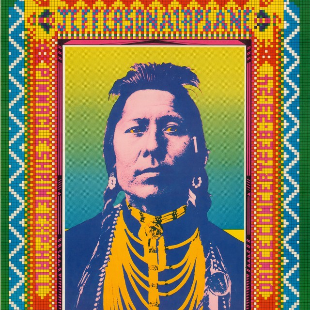
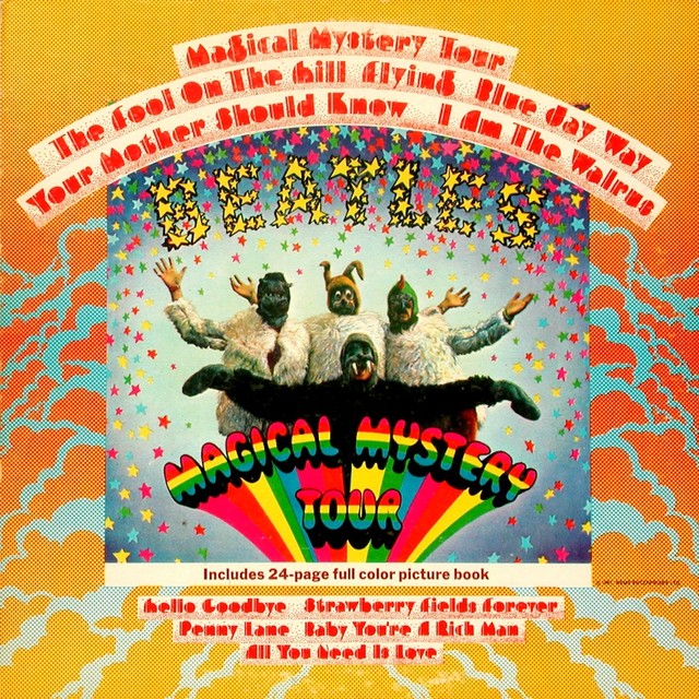
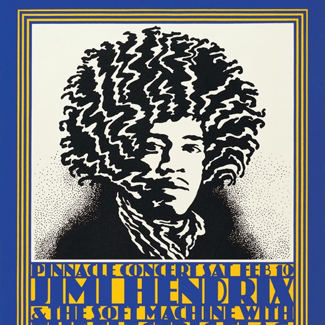
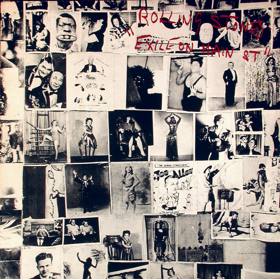
The Beatles, of course, pushed things forward several times starting with the art-directed covers of their first LPs, and with movies like A Hard Days Night and Help! The cover to Sgt. Pepper’s Lonely Hearts Club Band, designed by artist Peter Blake, featured historical figures that included artist Wallace Berman. That 1967 masterpiece was followed later that year by Magical Mystery Tour—with a cover designed by ArtCenter Advertising alumnus John Van Hamersveld, whose rock credentials include designing 1968 concert posters for Jefferson Airplane and Jimi Hendrix at the Shrine Auditorium, and later the iconic cover for the Rolling Stones’ 1972 Exile on Main St. In the following years the Beatles continued to define themselves visually and graphically with Richard Hamilton’s cover for the 1968 The Beatles (aka "The White Album"), music videos (“Hey Bulldog”), and their filmed rooftop performance—and final public appearance—atop the Apple Records building for their Let it Be movie.
Other major ’60s figures made iconic covers—Bob Dylan’s Freewheelin’ and Blonde on Blonde, The Beach Boys’ Pet Sounds—but it was hard to keep up with the Liverpudlians. John Lennon had attended art school (and later married the conceptual artist Yoko Ono) and McCartney was a frequent visitor to London’s art galleries.
Music on one level is about revolution. So it has to be statement making.
Ann Field, Chair, Illustration Department, ArtCenter College of Design
Music on one level is about revolution. So it has to be statement making.
Ann Field, Chair, Illustration Department, ArtCenter College of Design
But as the ’60s died, fashion and design sagged a bit as musicians grew unruly beards and retreated into their denim. “I think the unwritten rule,” says Reynolds, “was that the more serious you were, the less well you dressed.”
By the emergence of Bowie and T. Rex, about 1972, though, design was back in a big way. Not only did Bowie appear on nearly all of his album jackets, he was an entirely different character—sometimes from a different planet—on each one. Roxy Music, defined its stylistic shifts by extravagant covers featuring models. (Lead singer Bryan Ferry studied under Hamilton, England’s founding Pop artist.)
Punk came not just from working-class rage but from the London fashion impresario Malcolm McLaren and from art movements like Dada and the Situationists. And post-punk bands like Public Image Limited, Gang of Four and Wire were deeply shaped by conceptual art. “One of the reasons they picked the name Wire," Reynolds says of the quartet from London, “is because it would look good graphically. On any poster the name would look really big even if they were the third band on the bill.”
Some musicians were even more deliberate: Manchester, England label Factory Records based itself on Warhol’s Factory and put out iconic albums and posters by bands like Joy Division, New Order and the Happy Mondays.
By the time of the alternative rock revolution, The Smiths could draw not only from British film, but by riffing on old photographs from rock’s past. Belle & Sebastian extended this tradition of self-referential design, originally refusing to be photographed or appearing on their first few album jackets, which drew visually from ’60s British film and previous indie bands.
All these pictures were showing the kinds of relationships I wasn't having. These guys were like my family.
Dennis Keeley, Photography and Imaging Department Chair, on how imagery from West Coast jazz albums influenced his move to California
All these pictures were showing the kinds of relationships I wasn't having. These guys were like my family.
Dennis Keeley, Photography and Imaging Department Chair, on how imagery from West Coast jazz albums influenced his move to California
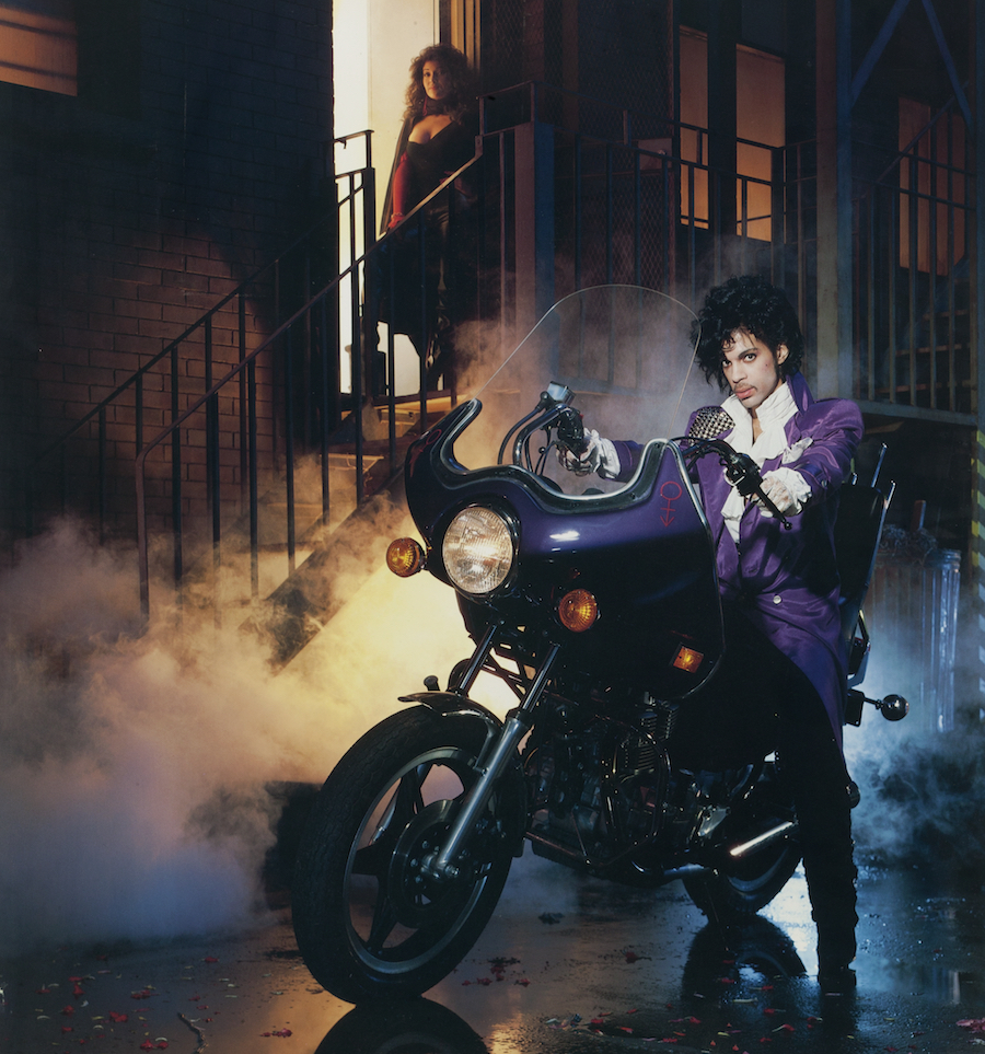
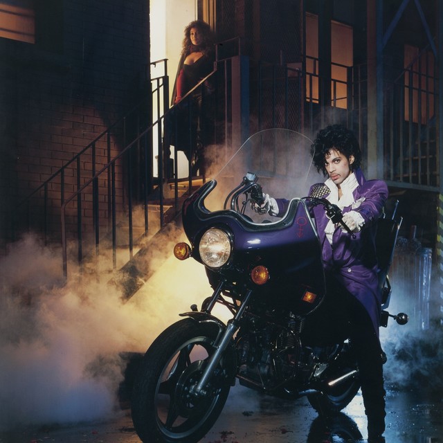
Some musicians needed or wanted visual elements to define them. Prince gave himself an origin myth with the movie Purple Rain, winning millions of fans in the process. Sonic Youth—a noisy band from New York whose bassist, Kim Gordon, studied art at Los Angeles’ Otis Art Institute—used art by major figures like Gerhard Richter (Daydream Nation) and Richard Prince (Sonic Nurse) for its album jackets. R.E.M. signaled its connection to a submerged and mystical strain of Deep South culture by using the Outsider artist Rev. Howard Finster for album jackets. (The Rhode Island School of Design-educated Talking Heads enlisted Finster for the cover of Little Creatures.) Since his debut, Beck—whose grandfather was part of the Fluxus art movement—has used heavily conceptual covers.
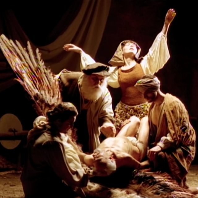
Sometimes, as with Jackson’s “Thriller” or Purple Rain and A Hard Day’s Night, a music video or film can put an artist on a higher level commercially or critically. Tarsem Singh (BFA 90 Film) made the video for R.E.M.’s “Losing My Religion” as a 30-year-old ArtCenter student inspired by a Gabriel Garcia Marquez story and the artist duo Pierre et Gilles: The video, song, and accompanying album (Out of Time, just reissued in a 25th anniversary set) finally broke the group with a mainstream audience.
But something happened at the end of the last century: The 12" x 12"; of the vinyl album turned into the 4.724" of the CD cover. The television and movie screens we used to watch films and video on shrunk to fit a phone we can stash in our pocket. And piracy, file sharing, music streaming, and other developments cut the century-old music business into ribbons.
Is it all over? “Music on one level is about revolution,” says Field. “So it has to be statement making.” It’s far more hard to make a statement on a smaller canvas.
All musicians consider themselves artists. A lot of them paint. They're very inclined to have an opinion on the visual; they're very attuned to it.
Ann Field, Illustration Department Chair
All musicians consider themselves artists. A lot of them paint. They're very inclined to have an opinion on the visual; they're very attuned to it.
Ann Field, Illustration Department Chair

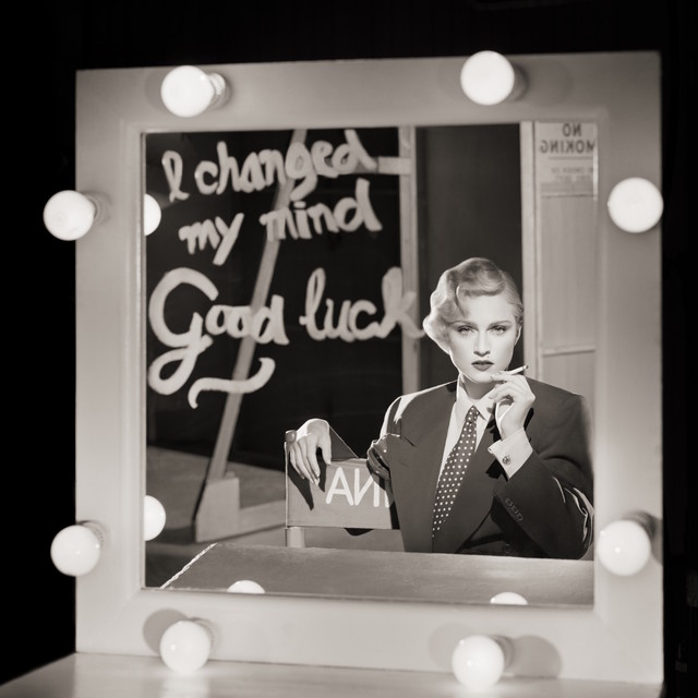
Reynolds sees the state of things as complex and mixed. “The video has made a comeback, often on hand-held devices,” he says. Beyonce’s Lemonade—a heavily choreographed and art-directed full-length film for one of the most powerful albums of last year—shows just how important art and design remain for music’s impact.
At the same time, many people (including music journalists) get their music as a stream or a download rather than picking up a large piece of vinyl or even a CD at a record shop. “I can’t think of the last album cover that made me say, ‘Whoa!’” says Reynolds. “A lot of rap records, you can’t even buy them in solid form.”
Still, some are trying. Labels like Cologne’s jazz/classical label ECM and New York’s eclectic Nonesuch put great attention into handsome and stylish album design. Some designers find a way to accommodate both past and present: The design for Brad Mehldau’s 2016 Blues and Ballads takes classic bold, monochromatic Blue Note iconography and adds a 21st-century twist with its use of visual texture. In this way it echoes the jazz pianist’s playing, which is both tradition-inspired and deeply, idiosyncratically personal.
Alumna Jeri Heiden, who studied Graphic Design at ArtCenter, went on to work at Warner Brothers in 1982. She now runs a Silver Lake firm called Smog with her husband and has designed covers for Madonna, Chris Isaak, K.D. Lang, Ben Folds, and the Decemberists. She’s gone from vinyl to CD back to vinyl, with an emphasis on large and ambitious reissues of significant recordings. “It was big, then it got small,” she says. “Then it got big again.”
Scott Timberg is a Los Angeles-based arts and culture writer. A former LA Times and Salon staffer, Timberg is the author of Culture Crash: The Killing of the Creative Class.