9 of 13
✕
%E2%80%9CI+had+this+architectural+training+that+I+got+from+%5Bgraphic+designer+and+friend%5D+Saul+Bass%2C+starting+in+the+%E2%80%9880s.+My+father+was+an+aeronautical+engineer%2C+and+my+grandfather+was+a+patent+person.++I+had+that+whole+background.+I+don%E2%80%99t+make+three-dimensional+things+very+often.+I%E2%80%99m+usually+working+on+two-dimensional+work.++This+was+the+first+time+I+was+able+to+really+make+a+physical+object+with+that+training.+The+yellow+and+red+in+the+sign+are+fast+colors.+I+found+a+kind+of+very+light+blue%2C+like+a+gray.++So+rather+than+using+gray%2C+which+is+so+flat+and+dead%2C+I+put+a+little+bit+of+color+into+it%2C+making+it+this+light+turquoise%2C+to+set+off+the+vibrancy+of+the+primary+colors.%E2%80%9D
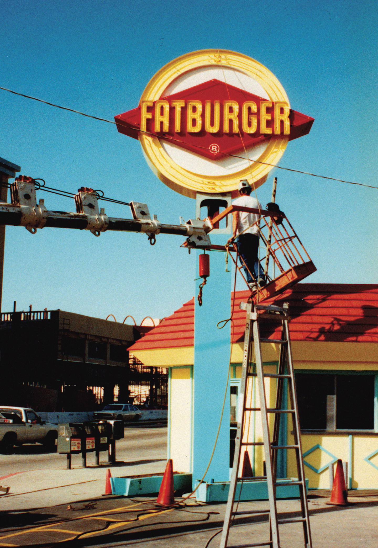
Fatburger logo and sign—early 1990s

“I had this architectural training that I got from [graphic designer and friend] Saul Bass, starting in the ‘80s. My father was an aeronautical engineer, and my grandfather was a patent person. I had that whole background. I don’t make three-dimensional things very often. I’m usually working on two-dimensional work. This was the first time I was able to really make a physical object with that training. The yellow and red in the sign are fast colors. I found a kind of very light blue, like a gray. So rather than using gray, which is so flat and dead, I put a little bit of color into it, making it this light turquoise, to set off the vibrancy of the primary colors.”


Share
facebook twitter LinkedIn Email